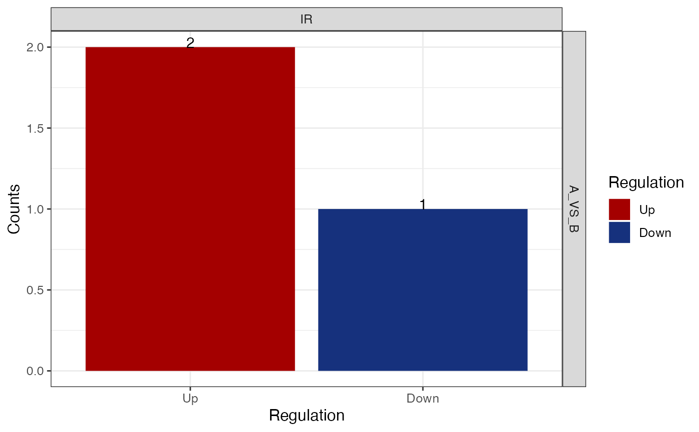
Generate a barplot of diff ASE counts.
Usage
get_diff_ASE_count_barplot(
  x,
  col_up = "#a40000",
  col_down = "#16317d",
  font_size = 12,
  event_type = NULL,
  sample_comparisons = NULL,
  show_counts = TRUE,
  ...
)
Arguments
- x
an object of class parcutils_ase.
- col_up
a character string, default
#a40000, denoting valid a color name for "Up" regulated genes.- col_down
a character string, default
#16317d, denoting valid a color name "Down" regulated genes.- font_size
a numeric, default 12, denoting font size in the plot.
- event_type
a character vector or a string denoting type of events to plot. Default NULL, includes all.
- sample_comparisons
a character vector or a string denoting sample comparisons to plot. Default NULL, includes all.
- show_counts
a logical, default
TRUE, denoting whether to show counts on each bar.- ...
Other arguments pass to the function
ggplot2::facet_grid()
Examples
se <- SpliceWiz::SpliceWiz_example_NxtSE(novelSplicing = TRUE)
SpliceWiz::colData(se)$treatment <- rep(c("A", "B"), each = 3)
res <- run_ase_diff_analysis(x = se, test_factor = "treatment", test_nom = "A" ,test_denom = "B",  IRmode ="annotated",  cutoff_lfc = 0.6, cutoff_padj = 1, regul_based_upon = 2)
#> Mar 05 15:54:41 Performing edgeR contrast for included / excluded counts separately
#> Mar 05 15:54:43 Performing edgeR contrast for included / excluded counts together
SpliceWiz::colData(se)$replicate <- rep(c("P","Q","R"), 2)
get_diff_ASE_count_barplot(res, event_type = c("IR") )